Dear Under Armour,
I've been thinking quite a bit about Texas Tech's uniforms. You see, I’m not a design person by trade. Oh, no. Actually, I’m an attorney in my day job and I write for this pretty awesome site called, Viva The Matadors, when I have the time. Even though I do both of those things, I admittedly have a passion for design. I’m always curious about why things look the way that they do. I’m interested in why a particular font is used over another. I love thinking about why a web site looks the way that it does. I love studying logos. All sorts of logos. Business logos, sports logos, really anything where someone has incorporated a word or a phrase into something visual as well. I consider myself an amateur when it comes to design, but it's something that interests me greatly.
I’ve been pretty quiet about Texas Tech uniforms. I understand that the uniforms really aren’t for me, but they are for the recruits and making news and all of those sorts of things. I get that, I honestly do and I’ve considered writing about Texas Tech’s uniforms for the better part of two years. Two years of figuring things out. Two years of considering and thinking about the uniforms. I want it to be clear that what I'm about to write isn't reactionary in any way shape or form as most people know that I try not to be reactionary about anything.
Now, I’m ready.
Stop shitting on Texas Tech's uniforms and Texas Tech's brand.
Elements and Principles of Design
One of the things that when you read about terrific design, not just uniform or logo design, but design in general, is that the focus needs to be simplicity and clarity. Harmony and simplicity. There must be some real choices about balance and color palate and all of those things. I’m going to teach you a bit about design so that we can all be on the same page and so you can know where I’m coming from. I found this terrific Australian article that keeps things pretty simple about the elements and principles of design (Oh, and I’m sure there are a ton of people out there that have lived their lives learning and studying about design and here I am quoting just one source. Please feel free to add to the discussion. Advertising folks could probably add a ton here, but I have to make this digestible and readable too.):
The elements of design are the things that make up a design. The Principles of design are what we do to those elements. How we apply the principles of design determines how successful the design is.
Hopefully this makes sense, it does to me, to think that the elements of design must create and become the principles of design. So let’s get to those elements:
The Elements of Design
LINE - The linear marks made with a pen or brush or the edge created when two shapes meet.
SHAPE - A shape is a self contained defined area of geometric (squares and circles), or organic (free formed shapes or natural shapes). A positive shape automatically creates a negative shape.
DIRECTION - All lines have direction - Horizontal, Vertical or Oblique. Horizontal suggests calmness, stability and tranquillity. Vertical gives a feeling of balance, formality and alertness. Oblique suggests movement and action.
SIZE - Size is simply the relationship of the area occupied by one shape to that of another.
TEXTURE - Texture is the surface quality of a shape - rough, smooth, soft hard glossy etc.
COLOUR - Colour is light reflected off objects. Color has three main characteristics: hue or its name (red, green, blue, etc.), value (how light or dark it is), and intensity (how bright or dull it is).
That’s pretty simple, right? Lines, shapes, size, color, texture, etc. All of those things make up what any design is, but here’s where we separate good design from any design, the principles of design.
The Principles of Design
BALANCE - Balance in design is similar to balance in physics. A large shape close to the center can be balanced by a small shape close to the edge. Balance provides stability and structure to a design. It’s the weight distributed in the design by the placement of your elements.
PROXIMITY - Proximity creates relationship between elements. It provides a focal point. Proximity doesn’t mean that elements have to be placed together, it means they should be visually connected in someway.
ALIGNMENT - Allows us to create order and organisation. Aligning elements allows them to create a visual connection with each other.
REPETITION - Repetition strengthens a design by tying together individual elements. It helps to create association and consistency. Repetition can create rhythm (a feeling of organized movement).
CONTRAST - Contrast is the juxtaposition of opposing elements (opposite colours on the colour wheel, or value light / dark, or direction - horizontal / vertical). Contrast allows us to emphasize or highlight key elements in your design.
SPACE - Space in art refers to the distance or area between, around, above, below, or within elements. Both positive and negative space are important factors to be considered in every design.
Ahh, I think we’re getting somewhere. When you look at good design, it’s imperative to keep these things in mind when you think about good design. And think about these things when you think about Texas Tech’s uniforms. Is there a balance to the uniform design, what about the proximity between the different items and elements (see above, the color, lines, shapes, etc.)? What about alignment? Is there a sense of order with Texas Tech’s design? What about repetition, the sort of repetition that creates a name and brand association and consistency? What about the idea of contrast to emphasize those terrific design elements?
Simplicity
Now that I’ve got you thinking about design elements and principles, let’s think about simplicity. You know, there’s this thought that Oregon has this crazy off the wall and ridiculous design style, and we’ll get to that a bit more later, but I want you to think about simplicity in general because simplicity is not necessarily simple. Those two things don’t go hand-in-hand all of the time. Simplicity, or the concept of it, can be incredibly difficult.
For example, thinking of a website name is a lot more difficult than you would expect. I probably spent two weeks thinking of just the right name for Double-T Nation and Viva The Matadors. Both names had to be simple, easy to remember and memorable. It sounds dumb, but it took me a lot of time and effort to be really simple.
Steve Jobs was know as a person that emphasized simplicity. Jobs’ emphasis on the idea of simplicity was incredibly important to creating the Apple products that so many of us know and love. One of Jobs’s designers talked about how Jobs and Apple worked to get to the bottom of a product:
Like most designers, Ive enjoyed analyzing the philosophy and the step-by-step thinking that went into a particular design. For Jobs, the process was more intuitive. He would point to models and sketches he liked, and dump on the ones he didn’t. Ive would then take the cues and develop the concepts Jobs blessed. In Ive, Jobs met his soul mate in the quest for true rather than surface simplicity. Ive, sitting in his design studio, once described his philosophy:
"Why do we assume that simple is good? Because with physical products, we have to feel we can dominate them. As you bring order to complexity, you find a way to make the product defer to you. Simplicity isn’t just a visual style. It’s not just minimalism or the absence of clutter. It involves digging through the depth of the complexity. To be truly simple, you have to go really deep. For example, to have no screws on something, you can end up having a product that is so convoluted and so complex. The better way is to go deeper with the simplicity, to understand everything about it and how it’s manufactured. You have to deeply understand the essence of a product in order to be able to get rid of the parts that are not essential."
That’s a pretty terrific explanation, at least for someone like me who likes to read about design and try to understand design and constantly think about good design. Simple is not easy or minimalism or anything like that. One more from Jobs:
"Simple can be harder than complex: You have to work hard to get your thinking clean to make it simple. But it’s worth it in the end because once you get there, you can move mountains."
Weighing In on the Competition
One of the biggest criticisms about the Oregon design is that they’re just crazy and they have a ton of these ideas and uniforms and therefore, the design must be crazy. Actually, that’s pretty far from the truth.
The terrific thing about Oregon is that they have embraced two designs and they've built an empire on it. But those two designs are actually very simple. It's the wing with the feather, whether it be on the helmet or on the jersey, and the Oregon "O". That's it. Everything plays off of those two very simple design aspects. Oh sure, Oregon has varied a bit after that, and they've had a few throwback uniforms, but generally speaking they use the wings and the Oregon "O". They have also used five colors: green, yellow, grey, black and white. Lots of variations of green, but I think that's easier to do with green than with red. There is one pink helmet for cancer research, but generally speaking Oregon seems to stick pretty much within those variations of colors.
What about another Nike school, like Oklahoma State. I know that we like to make fun of Oklahoma State for copying everything, but the designers for the Cowboys pretty much have the exact same philosophy with regard to their logos and colors. There are two main designs, the "OSU" logo and the Pistol Pete. The colors that they use are orange, black, white and grey. Pretty simple, but they've taken those designs and colors and done a ton with it.
Now, let's get to our beloved Red Raiders. The database at Uniform Critics is just through 2013 and does not include the 2014, but luckily, I've been tracking 2014, so at least we have that. Texas Tech has used one primary logo for the most part, so that's good, but over the past few years, Under Armour has attempted to introduce a handful of logo designs on Texas Tech's helmet, from the Wounded Warrior, to the Lone Survivor, to the Lone Star Pride helmets with different variations of logos and design. Some of the military themed uniforms have had camouflage, red, white and blue, and some wings on it with some word cloud type of design on it. With the Lone Star Pride uniforms, there have also been varying uses of red, white and blue and uses of a star for the logo on the helmet.
Since before the 2014 season, Texas Tech has used the following on their helmet logo: standard double-t, camouflage double-t, a helmet with a state of Texas and the double-t on one side and a Texas star on the other, a helmet with a double-t with the state of Texas behind it and a number on the other side, a helmet without any double-T on it, but just has wings and words on it, and a masked rider logo on one side and a number on the other, but the logo could not be seen unless you were close up. That's six logos or helmet elements. In 2014, Texas Tech has utilized the standard double-t, the old school double-t, the ombré helmet with the masked rider on it, a black helmet with the red masked rider on it (both of which are really visible from the stands) and a tri-colored helmet that is to depict the Texas state flag. That's four different designs. Just in case you were curious, that's 10 different helmet designs over the past few years.
Now, the colors. Texas Tech has used the following colors: red, white, black, camouflage, blue, dark grey, ombré, which had some silver in it or a lighter gray, an old school gray, and a bi-colored jersey that was red and black. That's nine or ten color combinations if you consider the bi-colored combination to be two different things or one.
Anyone want to take a stab as to where I might be going with all of this?
The Best in College Football
What makes a good or great uniform or logo is a matter of taste, but that still doesn't mean that we can't at, the very least, point to folks that think about uniforms and logos as much as anyone, and see what they have to say. Take this USA Today article about the 10 best uniforms in college football. I'll run down the list of the top 10: Oregon, Michigan, Texas, Notre Dame, Auburn, Georgia, USC, Alabama, Boise State, Ohio State.
There's a couple of things going here in that you may disagree with the list, but when you think of all of those teams and all of those uniforms, you think of a uniform. A uniform that is iconic and particular and has stood the test of time. Oh, yeah, some or most of these teams have some sort of special uniform or whatever, and most of those are pretty terrible too. Adidas is known for trying to jam a square peg in a round hole and come up with some shitty looking uniform for Nebraska or Wisconsin or UCLA and it looks terrible. The other thing is that one of these uniforms are Under Armour uniforms. Auburn. Even the "honorable mention" are not UA uniforms.
What about another publication, one of my favorite sites, Uni Watch, and one of my favorite writers that writes about uniforms, Phil Hecken. Here's his top 25: Auburn, Oregon State, Navy's alternates (as a Nike school), Alabama, Texas, Florida, LSU, Oregon, Arizona State, Michigan State, Penn State, Northwestern, Georgia, Tennessee, Virginia Tech, California, Michigan, Utah State, UCLA, Oklahoma, Oklahoma State, San Diego State, Minnesota, Vanderbilt and Marshall. In case you're counting, that's just two UA schools, Auburn and Northwestern.
Oh, I know, you're probably thinking that I dislike Under Armour and no, that's not the case at all. I actually love their products and some of my favorite Texas Tech products are Under Armour. I have a red UA hoodie, a new UA fitted black hat and I bought this shirt and this shirt (we'll get to more of this later). The quality is great and the designs look terrific. You could also think that Under Armour doesn't have a long list of colleges and that's probably true to an extent, but the one uniform that is on both lists, Auburn, has no alternates. No uniforms for a particular game, or crazy assed helmets or anything like that. According to Uniform Critics, they have 4 uniform combinations. Yeah, four.
And if you read the critiques of those uniforms, almost all of them roundly dislike the special uniform. Generally speaking this appears to be a designer trying to earn his or her paycheck by creating some sort of new twist or some to justify a uniform change that doesn't really work at all. We, as Texas Tech fans should know about one-off games because Texas Tech seems to have had more than their fair share of uniforms one-off uniforms.
Alright, I think I, at least for me, have established what I think good uniforms are and the proper use of logos within a given uniform. It's pretty simplistic. Keep to some key logos, no more than two. Make them prominent on the helmet and adhere to the design principles. Make sure the logo is balanced on the helmet and the logo itself creates a focal point for the rest of the uniform. Make sure that the logo is properly designed and that there is sufficient contrast for the logo to be the show and not a distraction and make sure there is sufficient space within all of these elements. Pretty simple for a helmet, what about the uniform itself? Same principles apply. There needs to be a balance and a relationship between all of the design elements of the uniform. Make sure that there is some sort of order to the organization of the uniform and does the use or some aspect of the uniform create some sort of repetition within the design. Is there sufficient contrast to the elements of the design? You get the idea. The key for all of those uniforms and logos is that there's a lot more of these design principles than not.
Now . . . let's get to Texas Tech.
We Don't Want Leftovers
Before I get to my main point, I want to talk a bit about Texas Tech’s uniforms for the Oklahoma game. It won’t take much time.
We don’t want Under Armour’s leftovers. Using the design that has been utilized for a high school All-American game is just about the shittiest thing you could do. The thing that ticks me off more than anything else, is that slapping the words Texas Tech on it and calling it a day is disappointing. It’s embarrassing. Texas Tech is using a year old design from a high school all-star game.

Recognize that jersey on the right? Yeah, it was Texas Tech's jersey for the Oklahoma game except for the neon yellow numbers.

Photo credit to Michael C. Johnson of USA Today sports.
And don't forget the wording on the left leg. That was also used this year for Texas Tech as a "new" design element. Well, I guess it was new to Texas Tech fans.
We'll get to the helmet in a bit.
I’ll make this pretty simple. Texas Tech is better than that. I’m sure that design and implementation isn’t the easiest thing in the world, but to give Texas Tech the leftovers from a high school game from December of 2013? If you don't have the time or inclination to design a new and unique uniform for Texas Tech, then we'll just pass. No. Freaking. Thank. You.
And I don't even know where to start with the Lone Star Pride uniforms and the military appreciation type of uniforms. They're all terrible. That's quite simply the truth. And don't get me wrong, this has nothing to do with me not loving Texas and/or America. I love them both, dearly, but if you're going to do these sorts of uniforms, slapping some camo and/or red, white and blue on a uniform is not design. Pick a thing, yes, one singular thing, and go with it. If Texas Tech wants you to use the double-t with the state in the background, then great. Use that. Make that the focus, but don't stray from Texas Tech's colors. It creates uniform confusion. This is even more clear with the military appreciation uniforms. I'm all for honoring the military, but what about a really simple patch on the shoulder with the United States flag? It doesn't "have" to be big and overblown or a complete re-design to appreciate the military.
It's all not bad though. Some of it is freaking beautiful.
The Throwbacks . . . Perfection
Let's take a look at the throwback uniforms from 1993. I’m not allowed to post any photos from 1993, but here’s a photo of the uniform. There were a couple of really important and conscious design decisions that you can tell improved the overall look of the uniform. First off, the stripes on the sleeves were removed. Sleeves on stripes were almost a given in 1993 and I personally love them, but the design decision to replace the sleeves with a smaller old-school version of the double-t was a really nice touch. That small red double-t pops. The other decision was to remove the numbers off the top of the shoulders, which I'm also fine with.

As to the newer throw-back uniform, the stripes did make an appearance in the undershirt and I like that element. UA was able to focus on the Texas Tech brand on the jersey, the double-t, while still utilizing those stripes on the undershirt. The other change is that the lettering for "Texas Tech" on the front of the jersey has noticeably more red, which I think is good. The red was too light on the old jersey and barely visible. I also think the font size was reduced a bit to fit with the more modern jersey that doesn't have such a big font on the front of the jersey. IN looking at some old pictures of Zach Thomas, the "Texas Tech" is slightly bigger than the number, while the new version it all is uniform and the same size. The belt on the new jersey is grey or silver while the belt on the old version is black. I like keeping the color of the pants uniform, so I like that addition.
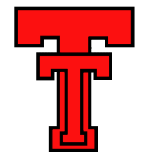
More than anything, the item that stands out the most is the idea that the focus of the uniform is the double-t. For all intents and purposes, it's the exact same logo that Texas Tech used in 1993. It's darn near flawless. The red with the white outline on the black double-t is darn near unmistakable. You know exactly who you are playing.
Logos need to be iconic. Create something iconic. Oh wait, Texas Tech already has something iconic.
I love the double-t logo. It is, for me, one of the better looking logos that’s around. And if given the choice, I’d take the non-beveled logo every day of the week and twice on Sunday. The re-design of that logo on the Arkansas was beautiful. It was identifiable from the crowd, it was clean, it stood out on the black helmet. I loved the white line around the double-t. It was perfect.
Juxtapose that with the the Masked Rider logo that has adorned Texas Tech’s helmets in the Holiday Bowl, against Oklahoma State and against Oklahoma. Placing that big-ass logo on the helmet just looks shitty. It doesn't fit the helmet. The design is indistinguishable. It looks out of place.
It’s no secret that teams with the most traditional logos are continually voted to have the best looking uniforms. Not multiple logos and three or four designs in a season, but a singular defining logo that is used on each and every uniform.
I've been sent enough cease and desist letters to know that Texas Tech thinks they own the phrase "double t" and and the colors red and black. Texas Tech already has the iconic logo. It's been sitting there for a few decades, but it's right there. It meets all of the principles of good design.
The biggest problem with what UA is doing with the Masked Rider logo is that Under Armour is trying to put too big of a logo on the helmet, which then makes the logo itself pretty much indistinguishable. In each of the games, starting with the Holiday Bowl from last year, and going through the Oklahoma State game and the Oklahoma game, I couldn't tell what the shit was going on with the logo.
These examples violate so many of the design principles, it's really not even funny (and I don't know what the hell I'm doing).


That last photo. Can you tell me what the logo is supposed to be from that angle? Me neither. It looks like shit. They all look like shit. They're oversized, gaudy and don't take into account alignment, contrast or the space on the helmet. And the masked rider on the pants leg. I don't even know what to say here.
This is essentially the Affliction-ization of Texas Tech's uniforms. That was a tough thing to write, so I'm going to take a minute and you might need to take a minute too.
Okay. I'm better. Yeah, I'm saying it. Under Armour is trying to make Texas Tech the Affliction of college football with these oversized logos and it looks like HELL.
Making News Does Not Equal Good Uniforms
Here's the thing that Under Armour needs to figure out, and I hope they figure it out sooner rather than later. Making news about uniforms does not mean that you are creating iconic uniforms. Other than the 1993 throwback, Under Armour has struck out so many times it's a bit sad.
I mentioned above the idea that Under Armour is essentially giving the same design element from the UA All-American game to Texas Tech with the "Guns Up" on the left leg. And then the angle in the jersey that came out a year ago in Kingsbury's first year. It was supposed to be a "Guns Up" in the jersey. Let me make it easy. You're trying too hard to make something out of nothing. It’s just a flipping check in a jersey, not a guns up. It doesn't signify anything?
Under Armour has gotten some things right. Navy's Midshipmen Uniforms? Oh hell yes. And the navy and gold comgination with the stripes across the chest? Yep, looks terrific. Someone took some time and effort to create something freaking beautiful. Notre Dame's new uniforms through Under Armour? That's pretty much uniform perfection. Or how about Northwestern's big stripe through the middle of the jersey? That works really well.
But here’s the deal, if you don’t see something from a design perspective, don’t just make shit up. Don’t try to shoehorn a design element and then make up a reason for it, like the check mark in Texas Tech’s jersey that was supposed to be a "guns up" but I always had to crane my neck to figure that out. It's really just a check mark. Contrast that with the white Navy uniforms, all of those unique, yes, unique in that they were specifically created for Navy and not leftovers, are really well thought out and intentional and those details stand out and make sense.
Create Something Meaningful
My biggest gripe about Under Armour is that I fail to see any direction with where the uniforms are going. I see no underlying theme with the military sort of uniforms. I see no underlying theme with the Lone Star Pride uniforms. Every year, someone tries to think of something that relates to those themes, but every single time, I feel that Under Armour forgets what is supposed to be the focus of each and every uniform. The double-t. That should be the focus each and every time that a uniform is created. You have to have an anchor and I’m positive that Under Armour hasn’t chosen an anchor, if they have, then I have no idea what it is.
Under Armour has created something pretty neat and something that's really pretty beautiful and different than anything I've seen before (click here for a huge version to see the close-up details).

I actually bought this t-shirt recently. I loved the throw-back uniforms and this was one of the t-shirts that was being sold by Red Raider Outfitters (see link above). I didn't even study the details until I wrote this article, but they're really fantastic. First of all, it's a very simple double-t and at first glance, it looks like the old school double-t with just a white outline. But actually, there is some beveling going on with the double-t. Look to the bottom and to the right as there is a light grey. This is actually pretty much a perfect amount of shadowing and outline all at the same time. It's understated, but clean all at the same time. The shadow actually shows up much better in person than in this photo, but it looks really good.
Next, the stripes, which are intended to look weathered (or at least I hope as it arrived this way). I'm guessing that on the standard jersey, they wouldn't be worn. Those stripes are bold and you could use them in a variety of colors, from red and black to black and white. What about black and white on a red jersey. OMG, that's some uniform porn right there. Have that bold stripe wrap around the jersey? That would look simply beautiful. And I've got no problem if this is a design element that is being used with Northwestern and Navy. It's a really unique design element that no one has used. The striping that they have used isn't over-used (although I would really prefer a white stripe on the purple jersey for Northwestern rather than black) and it is clean and it really makes the uniform stand out. If you want to make this stripe the signature for Under Armour uniforms? Yeah, now you're cooking.
The most encouraging thing is that yes, there is absolutely some thought and detail going into those uniforms. I want Texas Tech to be known for a brand. A look. A design. Not multiple things. And if Under Armour is going to do multiple things, then pick two things and do them well. Really well.
I know that this has been a bit rough on Under Armour, but as I first stated, this wasn't done on the spur of a moment or in haste. I took a lot of time to figure out why I didn't like the current state of Texas Tech's uniform design, especially with the Masked Rider theme with three of the more recent uniforms. It wasn't enough to just not like them, I wanted to know why my eye didn't agree with the design. I took the time to learn about design, albeit the education was very crude and on my own, I still took the time to figure this out.
I'm earnestly pleading with Under Armour to be more thoughtful in the design of uniforms. Oversized logos on helmets and pants is not thoughtful design. And if those design elements are a result of Kingsbury, then I'll cc him on this open letter because that ain't cool. Not even a little bit.
But you all are so much better than what you've done. I've already mentioned that I love your products. Seriously, if given the chance to buy an Under Armour hoodie or a Nike hoodie, it's not even a question even if the UA hoodie is more expensive. UA just feels like a superior product. I'm writing all of this because I care. I care a lot how Texas Tech looks. It's why I've spent close to 10 hours writing and researching this post alone, because I care.
Sincerely,
Seth Jungman
Manager of Viva The Matadors and Proud Red Raider


